Our offline design document for ZooLog+ sets out the user it is written for: a keeper who is “outdoors, gloved, in glare, glancing between animal jobs, on patchy-or-no signal”. Our positioning notes compress it further. ZooLog+ is the husbandry record “a keeper can use in the rain, with no signal, one-handed”.
Those are nice sentences. They only matter if they turn into numbers in the code. This post walks through five places where they did, names the published research that explains each choice, and is straight about where that research is weaker than its reputation, and where our own numbers fall short of our own brief.
Forty-eight points is not a glove
Paul Fitts showed in 1954 that the time it takes to hit a target grows with the distance to it and shrinks as the target gets wider. On a phone held in one hand, distance is how far the thumb has to travel and width is the size of the button. Both levers are in the design.
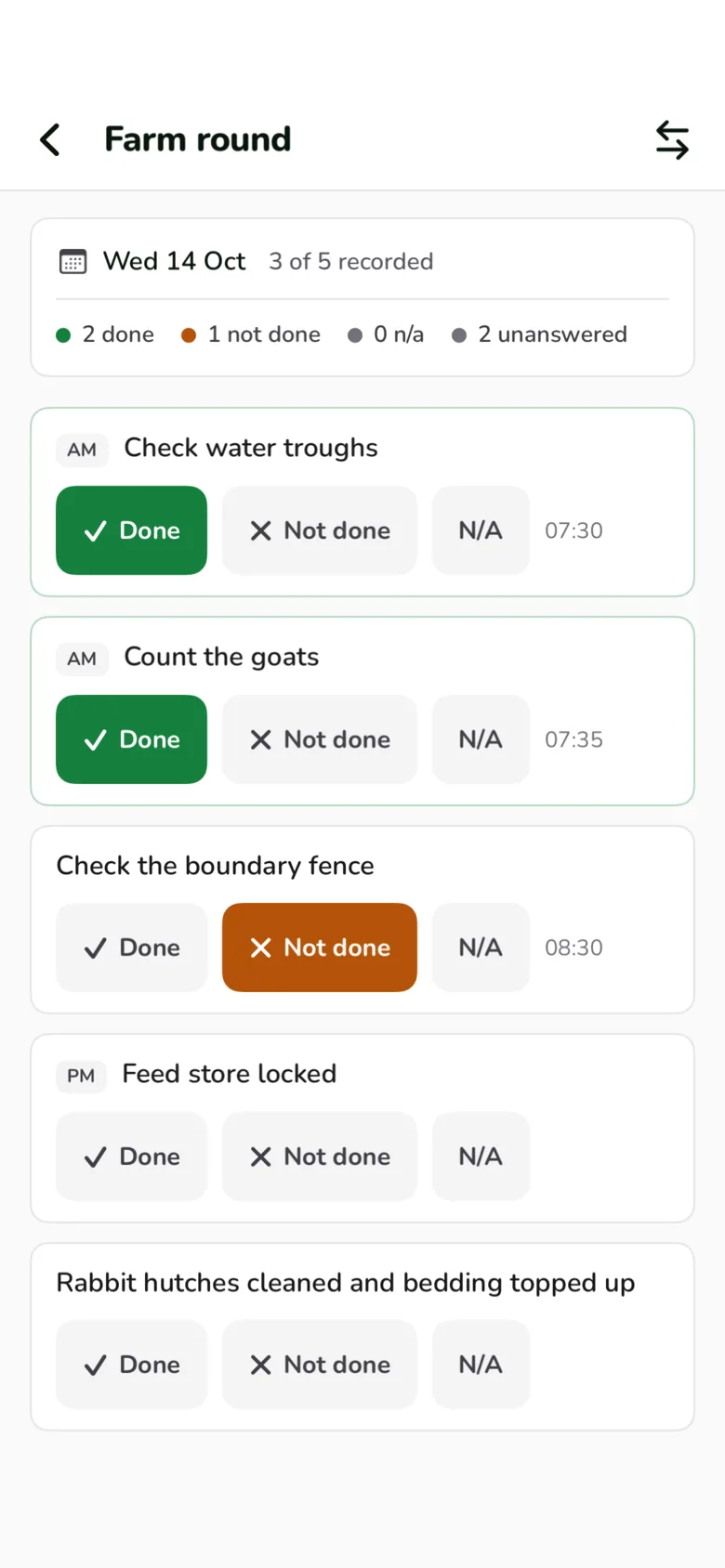
The size lever lives in ZooLog’s design tokens, the shared file both the iOS and Android apps are generated from. A keeper control is at least 48 points tall. An icon-only control gets a 44 point hit area even when the icon itself is much smaller. Admin screens are allowed 36. The daily round’s Done, Not done and N/A buttons sit on the 48 point floor. The Add a log sheet’s pickers and the main buttons on the sign-up and welcome screens are 56.
The distance lever is the dock. The “+” that starts every log is a 65 point disc in the middle of the bottom bar, on every tab, which is about as close to a right or left thumb as a screen allows. The four tabs, two either side of it, are each a fifth of the screen wide and 58 points tall.
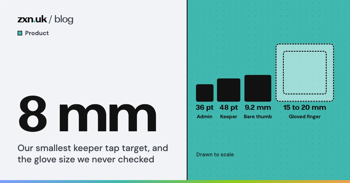
Now the uncomfortable part. Our own research note for the keeper Home, written on 31 July, suggested glove-sized targets of about 15 to 20 mm. It also said, in the same line, that the figure came from industry sources and that we should check keepers actually work gloved. We have found no record that we ran that check, and nothing we ship is built to that figure.
Our tap targets in millimetres, against a published figure and our own note
Physical size of each token on a 460 ppi iPhone, our arithmetic. The black bar is the glove figure from our own July research note.
Source: ZooLog design tokens and native source; Parhi, Karlson and Bederson (2006); ZooLog keeper Home research note, 31 July 2026
The best evidence we have is for bare thumbs. Parhi, Karlson and Bederson tested one-handed thumb use in 2006 and recommended 9.2 mm for single taps. Our 56 point controls and the “+” clear that. The 48 point floor, about 8 mm, does not, and neither does anything we have shipped come near 15 mm. A few controls sit below even our own floor: the save card’s close cross is 30 points, which we let pass because the card hides itself within seconds. Fitts’s law tells you which way to move. It does not tell you how big a gloved fingertip is.
One question at a time
W. E. Hick found in 1952 that the time to choose between alternatives rises with the logarithm of how many there are. That is the version that gets quoted. The caveat that rarely does is that Hick measured people reacting to lamps with keys, where every option was equally likely and already known. Picking from a list you have to read is closer to searching it, which the law was never meant to describe. Either way, fewer options per decision is quicker, and the honest reason is not a logarithm. It is that a keeper glancing at a phone between jobs should only ever be answering one question.
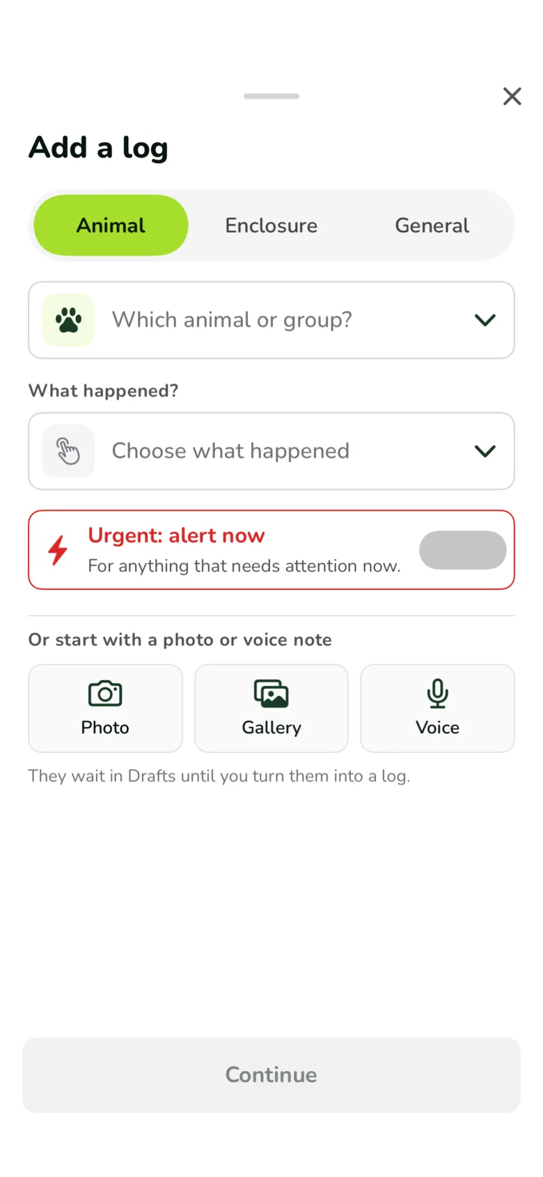
The old “+” broke that. One tap fanned out a small arc of discs, and on 15 October we added a sixth, Urgent, after a request for a one-tap way to report something urgent. Two weeks later Mark called the “+” cluttered, and our notes on the change found the arc mixed two different questions: what the log is about (Animal, General, Urgent) and how to start it (Camera, Gallery, Voice). Urgent was not really a kind of log at all, and on iOS its disc was still a placeholder that said urgent reports would arrive in the next update.
Six buttons and two questions, or one question at a time
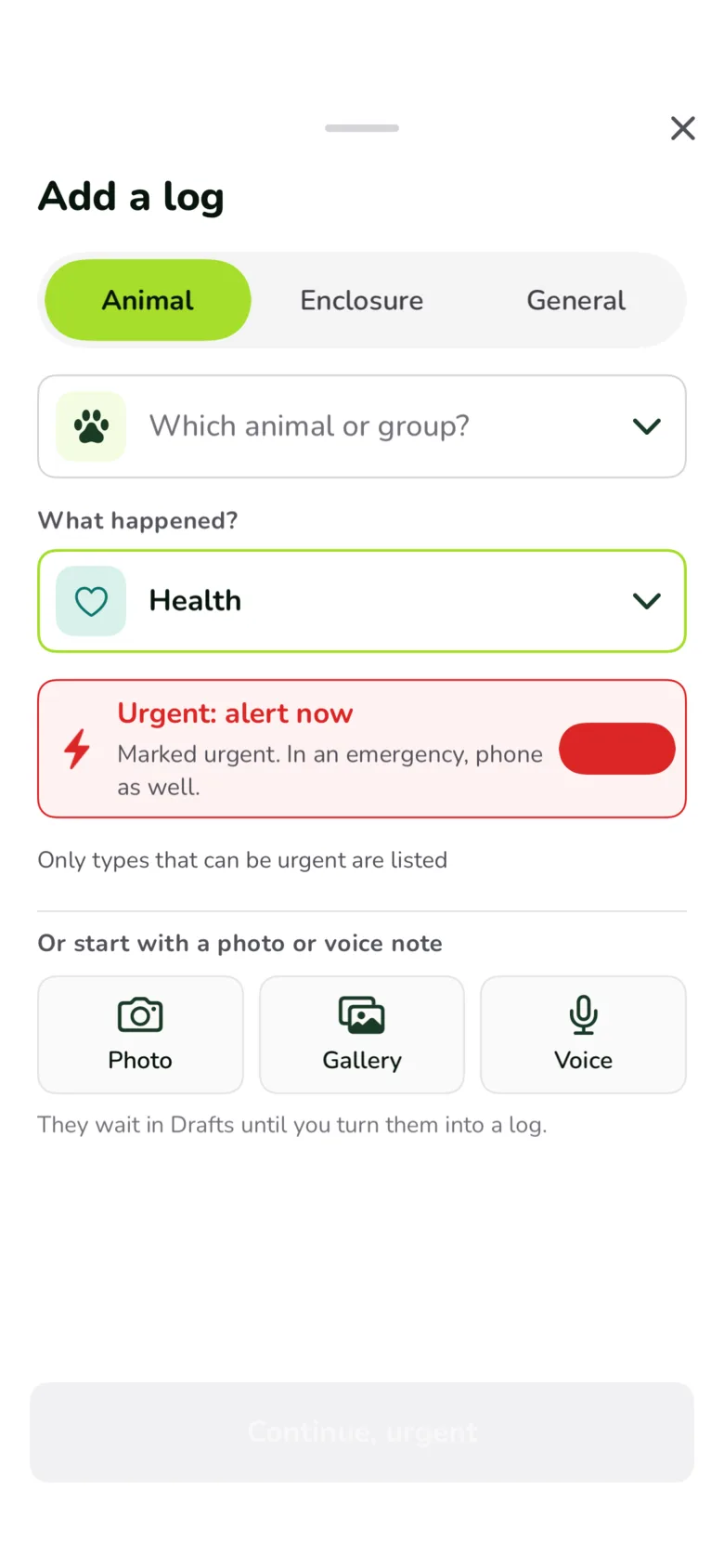
Left: the old "+" arc. Right: what the Add a log sheet lists as each answer narrows it.
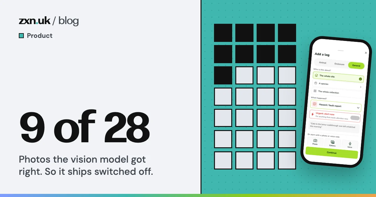
On 29 October one Add a log sheet replaced the arc on both platforms. A pill asks what the log is about. A row asks which animal or enclosure. Only then does “What happened?” offer a list, and it follows the pill: the catalogue has 42 log types a keeper can choose, and picking Animal leaves 16. Urgent became a switch, because an urgent animal log and an urgent site log are both real. Turning it on narrows the list to the 7 animal types that can be urgent, and an escape, a death or a post-mortem turns it on and locks it. On 3 November the General option gained its own first question, whether the log is about the whole site, a species or the whole collection, because some types only make sense for one of them.
The same idea runs through the smaller choices. Jakob Nielsen’s 1994 heuristic, recognition rather than recall, says people should see their options instead of remembering them. So every one of the app’s animals gets a picture: 93 icons, matched through a dictionary of 1,083 common, scientific and group names, with a paw as the fallback rather than a pair of initials. An August bug report caught a squirrel monkey wearing a chipmunk’s face, which is exactly the kind of mistake that teaches people to stop trusting the picture. Log types can be found by the words keepers actually use, so “fed”, “hay” or “diet” all find Feed.
A tick means the server has it
A glance only works if what you glance at is true. The single rule we hold hardest in ZooLog is that the word “Saved”, with a tick, means ZooLog’s server has the log. Until it does, the card that appears after a save says “Saved on your phone”, and the line under it says why it has not gone further: sending, waiting for signal, or could not send. Each state has an icon and words as well as a colour. The August design note gives the reason in four words: “gloves, glare, colour-blind”. Someone reading a phone in sunlight with one eye on an animal should not have to tell amber from green.
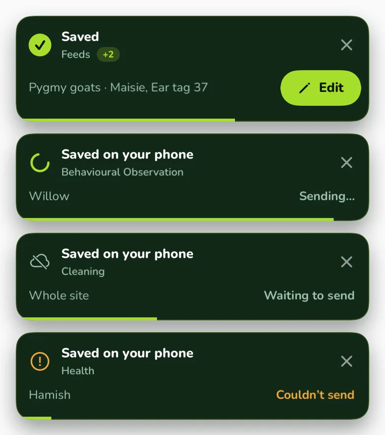
The header follows the same rule from the other direction. Its sync pill shows nothing at all when every log is on the server. In August our design note leaned towards a quiet “Synced” that was always visible. What shipped is silence, so a keeper learns that an empty header means everything has gone, and anything else arrives with words: “Review 2”, “Can’t reach” with a count, or a count saved on the phone.
That rule also makes mistakes cheap. After a routine save the keeper has 45 seconds to correct the log, timed on the phone by a clock that changing the phone’s time cannot stretch, with the server deciding the real cut-off. Edit only appears once the server has the log, because an edit to a log it has never seen would fail. In October a review of the screen judged the card too long and obstructive. It had stayed up for the whole 45 seconds of every save. Now it hides itself after 6, and the window carries on underneath.
Forty-five seconds to fix it, six seconds in your way
What happens after a keeper taps Save on a routine log.
There is a name for why that matters more than it sounds. Kahneman and colleagues showed in 1993 that people judge an unpleasant episode largely by its worst moment and how it ends: in their study most people chose to repeat a longer spell of cold water if its last 30 seconds were a little less cold. Applying a cold-water experiment to a save button is our reading, not theirs. But a keeper saves dozens of logs a shift, and each one now ends the same way: a tick, and then the app gets out of the way.
What is unfinished stays on screen
Bluma Zeigarnik reported in 1927 that people remember interrupted tasks better than finished ones. It is one of the most quoted findings in design writing, and it does not replicate well. A 2025 meta-analysis by Ghibellini and Meier found no memory advantage for unfinished tasks. What did hold up was the companion finding from Maria Ovsiankina: people tend to go back to a task that was interrupted.
So ZooLog does not rely on anyone’s memory. It keeps unfinished work in sight. On 13 October Drafts replaced Profile as the fourth tab, because photos and voice notes waiting to become logs are a daily job and Profile is not, and the tab carries a red count. Home shows how many drafts are still to sort. The daily round says “3 of 5 recorded” and counts the unanswered checks separately from the ones marked not done. Leaving a log you have started asks before it throws your entry away. And when our 1 November walkthrough found that logging several animals at once gave no sign of how many forms were left, the fix, merged on 2 November, was one line at the top of each form: “Log 1 of 2”.
The haiku came back
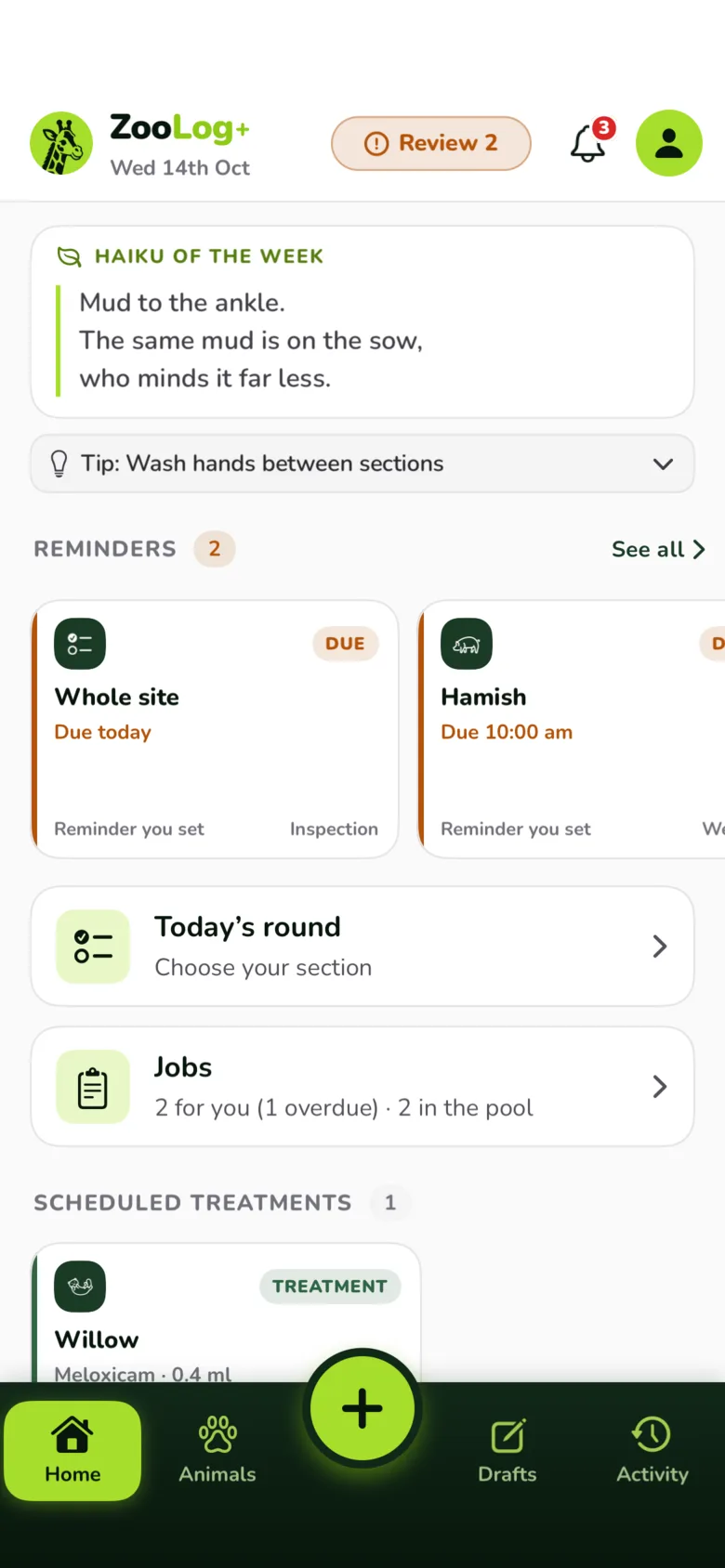
The one part of Home that asks nothing of anyone is a short poem. Mark wrote the first ones. The set has grown since, and one is shown each week in a card at the top of the screen. On 29 October our polish review judged that the card took about a fifth of the screen above the real work, and we folded it into a closed one-line strip. On 2 November Mark asked for the full card back: it is there to relax people into the app, so it should be seen every time. It shipped again the next day.
The research is kinder to Mark than to the review. Kurosu and Kashimura showed 26 cash machine layouts to people in 1995 and found that how pleasant a layout looked predicted how easy people expected it to be, more than its actual ease of use did. Tractinsky repeated the work in Israel in 1997 and the result held. The honest limit is that this is about perceived ease, not measured speed. We think a keeper who opens the app braced for paperwork and finds a poem about mud on a sow starts the job in a better frame of mind, and the work is one short scroll below it. We have not measured that, and we are keeping the card anyway.