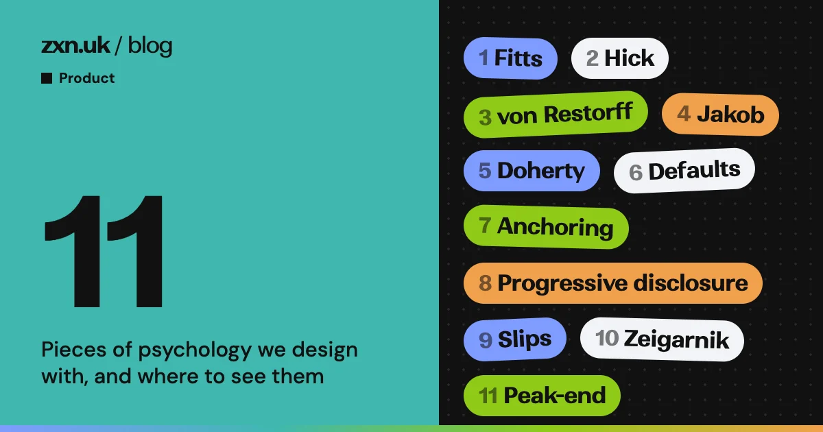
The comment at the top of TipBop’s tip page says a stranger is handed a badge with no explanation, taps it, and “must be finished in under ten seconds and three taps, one-handed.” Everything on that page answers to that sentence. Most of what it answers with is old psychology, mostly published between the 1920s and the 1990s with some later work, on how people move, choose, remember and judge.
This is the list we actually use, eleven ideas, each with the paper it comes from, the place in our own apps where you can see it, and the version of it that turns into a dark pattern. Some of the research is solid and some has wobbled since, and we say which. Every screenshot is fixture or demo data.
1. Fitts’s law: the button goes where the thumb already is
The idea. The time to hit a target grows with its distance and shrinks with its size. Paul Fitts measured it in 1954 with styluses and tapping plates; it has held up for mice, fingers and thumbs since.
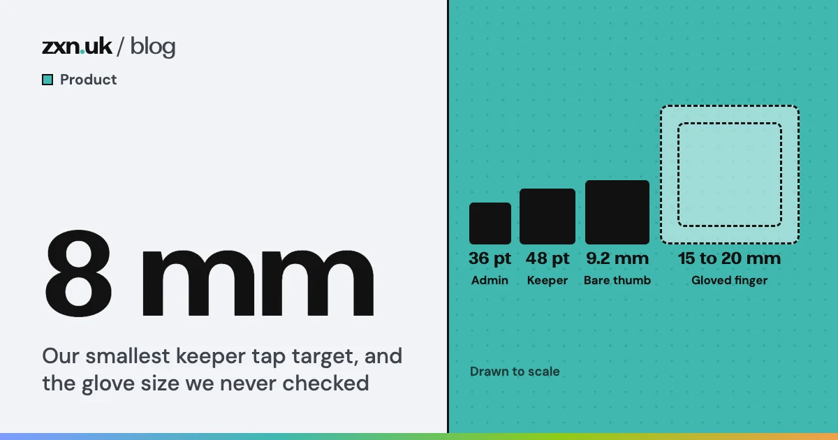
Where we use it. Every open TyreStack job ends in one button, pinned to the bottom of the screen, full width. The code describes it in one line: “The one big button at the bottom of a job: what the fitter does next.” It is at least 68 logical pixels tall, built on the largest of the touch sizes the app labels glove-sized. A fitter on a driveway has a wheel brace in one hand.
Far and small, or near and wide
Fitts (1954): the time to hit a target grows with log2(2D/W), where D is the distance to it and W is its width along the line of movement. Distances are illustrative.
ZooLog’s keepers have the same problem with wet gloves, and that has its own post.
What we refuse. The tiny, far “close” cross on a pop-up, or a Cancel set in grey in the top corner. Fitts works in reverse: make the way out small and distant and fewer people find it.
2. Hick’s law: the best number of choices is often one
The idea. Decision time rises with the logarithm of the number of equally likely choices (Hick, 1952). The curve matters more than the formula. In the model, going from four options to ten makes the decision about half as long again, not two and a half times as long. And it assumes people already know the options; an unfamiliar list gets read item by item, which is slower.
Where we use it. A TyreStack job never asks the fitter what to do next. It tells them. The app’s status flow offers exactly one action at each stage: “I’m on my way”, then “I’ve arrived”, then “Start work”, then “Finish job”. The only other route, Can’t complete, sits below as a text link.
More choices, slower decisions, but not in a straight line
Hick's model: decision time rises with log2(n + 1) for n equally likely choices the person already knows. Relative units.
What we refuse. Using choice as camouflage: twelve plan options so the cheap one is hard to find, or a cancellation flow with five offers before the button that cancels.
3. The von Restorff effect: one thing stands out, so make it the right thing
The idea. In a list of similar items, the one that differs is the one people remember (von Restorff, 1933). On a screen, that makes the odd one out the thing people notice and recall, so it had better be the thing you want them to do.
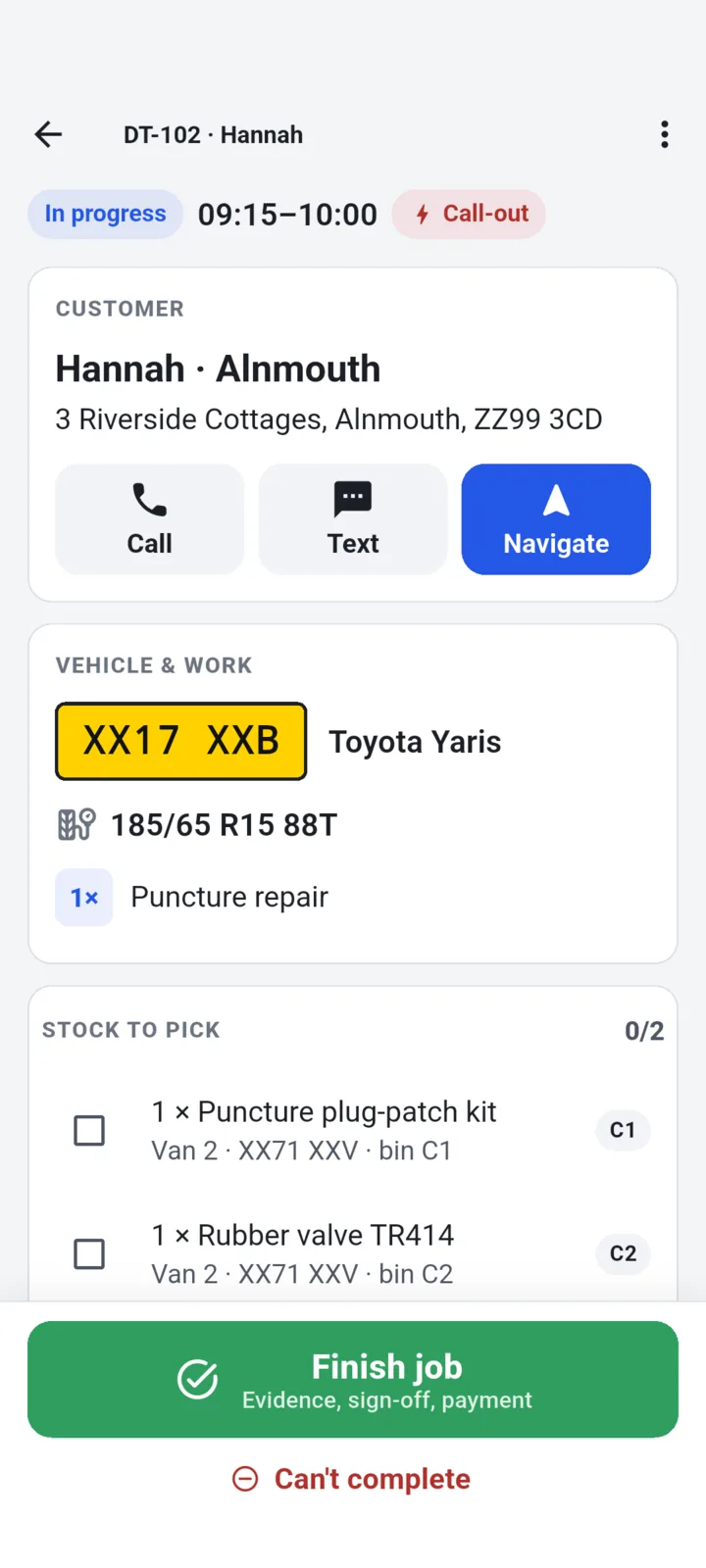
Where we use it. On the TyreStack job screen, Finish job is the only full-width green button. Can’t complete is red text, not a red button, so the two never compete. Our October polish review checked for this and found “no two competing primaries in the fitter”. It flagged the office pages where every row of a list has its own primary button, and recommended keeping them: each row is its own form, so it is one action repeated, not several fighting.
What we refuse. The cookie banner with a bright Accept and a grey Reject. On the TipBop website both buttons share one style, outlined, the same size, side by side.
4. Jakob’s law: people learn your app on everyone else’s
The idea. Jakob Nielsen put it this way in 2000: “Users spend most of their time on other websites,” so they expect yours to work like the ones they know. It is an observation from usability testing, not a lab result, and it is the one we break least.
Where we use it. When ZooLog was ported to Swift and Kotlin in October, the decision log chose each platform’s own furniture over a shared design. On Android, date pickers are the Material date dialogs; the log’s reason is two words, “platform convention”. On iOS, confirming that an animal is archived or marked deceased uses the system alert, the “native confirm idiom”. On 29 October we added a rule that no screen may be a dead end: every one has a back button, a swipe back or a close. An audit of both apps found five places that could trap you for a moment, and all five were fixed.
What we refuse. Breaking the conventions that protect people: a back button that does not go back, a swipe that is blocked to keep someone on a page.
5. The Doherty threshold: answer before they notice the wait
The idea. An IBM paper by Doherty and Thadani (1982) argued that productivity climbs steeply when a system answers in under about 400 milliseconds, against the two seconds then thought fine. The 400 ms figure is how the paper is usually summarised. Treat it as a practical line, not a constant of the brain.
Where we use it. ZooLog’s offline plan, written in August, puts a log on the phone’s disk before the screen animates, so saving never waits on signal. Then it is careful about what it claims. The same plan says a tick and the word “Saved” mean the server has the log, “full stop”; until then the app says “Saved on your phone”.
The microphone is the sharper example. Hold-to-talk starts the recorder the instant a finger lands, not after a long-press recogniser has spent about half a second deciding whether this is a tap or a hold, because that wait would cut off the first half-second of every note. On a real phone the recorder still takes about 0.3 seconds to come up, and on one test build a quick tap lifted the finger before then and saved a clip lasting milliseconds as a draft. The fix, on 26 October: letting go before the recorder has run for 600 ms counts as a tap, and recording carries on.
The first 700 milliseconds of a voice note
Times from ZooLog's decision log and its voice tests. The 400 ms line is the usual summary of Doherty and Thadani (1982).
What we refuse. Fast and false. A green tick for a write that is still queued feels responsive, and it is a lie the first time the phone stays offline.
6. Defaults: most people take the one you picked
The idea. Johnson and Goldstein (2003) compared organ donor consent between countries where you opt in and countries where you opt out, and found it far higher under opt-out. Critics note that the gap is in recorded consent and the gap in actual donations is smaller, which the paper itself says. The core finding, that a default carries weight, has held.
Where we use it. A TipBop worker chooses three suggested amounts, which start at £2, £5 and £10. The middle one is preselected, so the fast path is tap the badge, tap Apple Pay, authenticate. The fee is stated in words beside the amount, always, and is never a pre-ticked box. In ZooLog, attaching a location to a photo is off until a keeper turns it on, because, in the decision log’s words, “a location a keeper never asked to share must not be collected by default”.
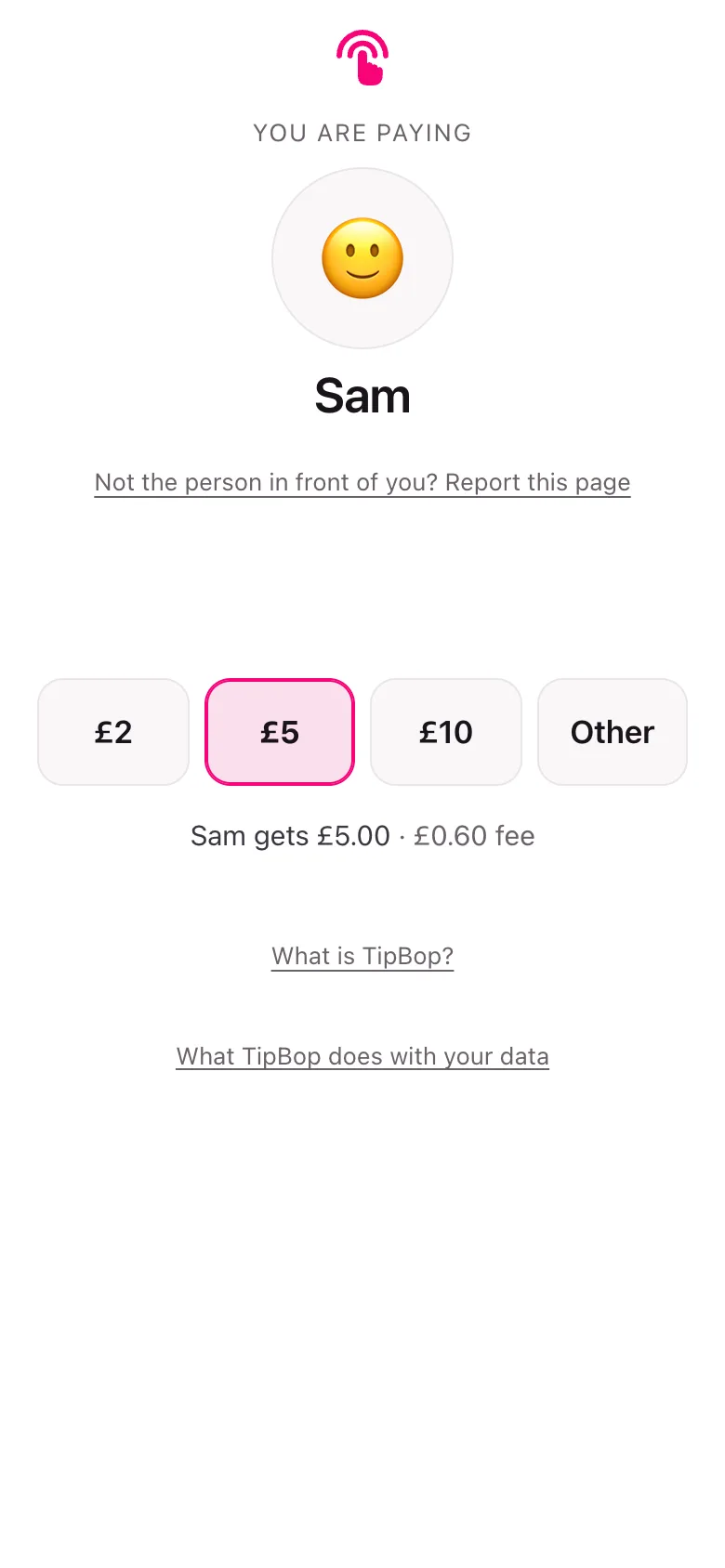
What we refuse. Preselecting the biggest tip, adding a “tip to the platform” by default, or burying the fee in a total.
7. Anchoring: the first number sets the scale
The idea. People estimate by starting from a number they have seen and adjusting too little (Tversky and Kahneman, 1974). Any figure on a screen becomes the anchor for what comes next.
Where we use it. TipBop’s suggested amounts are anchors, so the worker sets them, not us, and the slip check in section 9 measures against the worker’s own scale. On 6 November zxn.uk went the other way and took every price off its site, because one public figure “was inviting comparison and setting expectations before we knew the job”.
What we refuse. Tip screens that open at a high percentage so the “low” option still feels generous, and crossed-out “was” prices that were never charged.
8. Progressive disclosure: show what most people need, fold the rest
The idea. Nielsen (2006): defer advanced or rarely used options to a secondary screen, and an interface becomes easier to learn and less error-prone.
Where we use it. A ZooLog log for an animal by-products waste collection used to show every box from the waste transfer note. A review of the screen found that was too much, since the note already holds the carrier, the approval number and the destination. On 27 October the boxes were folded behind “Add details from the note”, and the photo of the note stayed the one required thing. On TipBop’s tip page, Other opens an amount field on the same page, never a second page, and “Not the person in front of you?” is a fold that adds no step to an honest tip.
What we refuse. Disclosure as concealment. Detail can be folded. Cost, risk and the way to cancel cannot.
9. Slips are not mistakes
The idea. Don Norman (1981) separated slips, where you meant the right thing and your hand did something else, from mistakes, where the intention was wrong. A slip needs a check at the moment it happens, not a lecture.
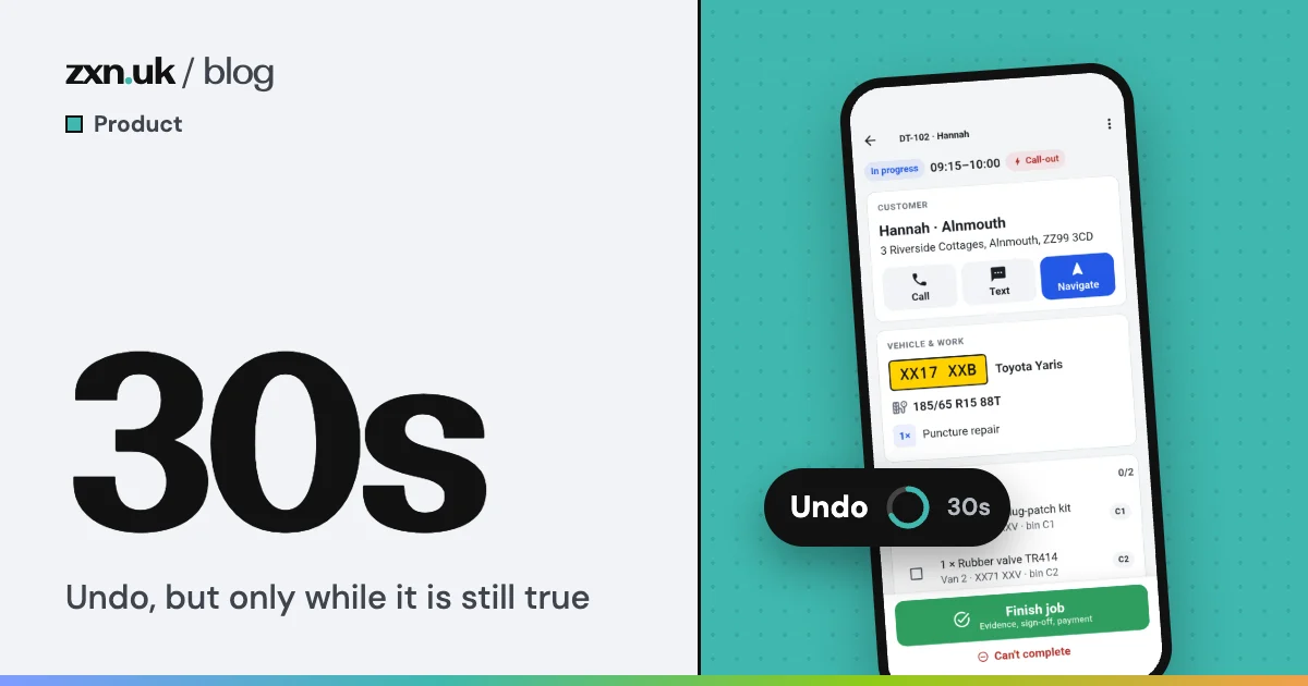
Where we use it. On the tip page, if a typed amount reaches five times the worker’s highest suggested amount, the pay button spells the total out in words and a note says why. A preset can never set it off, by arithmetic, so a normal tip gains no step. The code records the alternative we turned down, a two-tap confirm, because a pay button that looks live and does not pay is worse than none on the one screen where a stranger decides whether to hand over money. TyreStack’s version is a 30-second undo that is only offered while it would be honest, written up here.
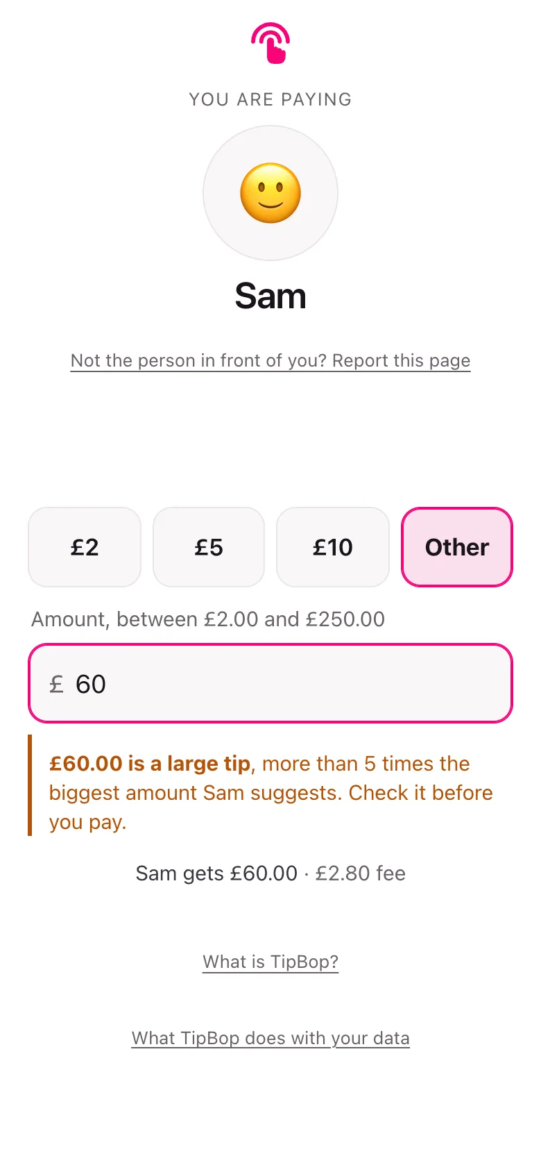
What we refuse. “Are you sure?” on everything. People learn to tap through a confirmation that appears every time, which means it is gone when it matters.
10. The Zeigarnik effect: open loops pull, but less than the posters say
The idea. Bluma Zeigarnik (1927) reported that people recalled interrupted tasks about twice as well as finished ones. That claim has not held up well. A 2025 meta-analysis by Ghibellini and Meier found no general memory advantage for unfinished tasks, but a reliable tendency to go back and finish them, the related Ovsiankina effect.
Where we use it. The weaker version, and only as plain status. ZooLog’s daily round shows “3 of 5 recorded” with the unanswered ones counted. TyreStack’s Today screen shows “1 of 7 done” with a bar. Both say what is left; neither scolds.
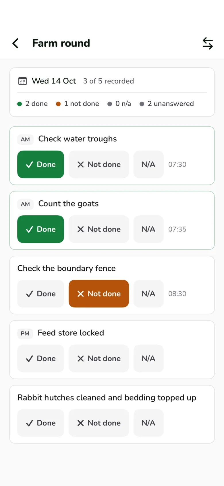
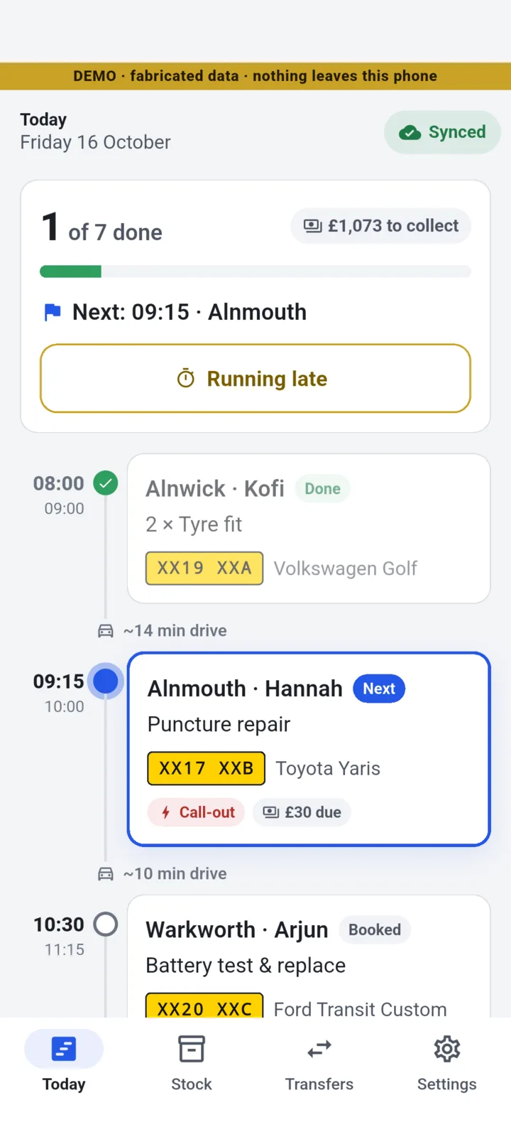
What we refuse. Profile-completeness bars, streaks and fake progress that exist to pull people back. ZooLog has no keeper leaderboard for the same reason.
11. The peak-end rule: the last screen is the one they remember
The idea. In Kahneman and colleagues’ 1993 study, people held a hand in 14 °C water for 60 seconds, and on another trial for 90, the last 30 while it warmed a degree. Most chose to repeat the longer trial. Memory of an experience leans on its worst moment and its end, and largely ignores how long it lasted.
Where we use it. TipBop’s confirmation page is, in its own source’s words, “the one moment the brand gets to celebrate”. The tip amount is the hero, in the brand gradient, only when the money has actually moved. A failed payment gets a plain mark and “Nothing has been charged.” The one optional extra in the product, a receipt, appears here, after the money and never before it.
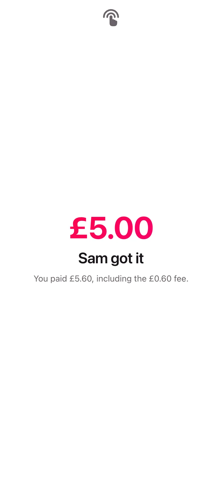
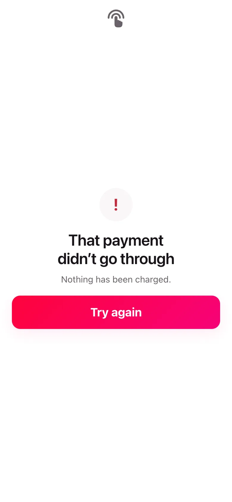
What we refuse. Ending on an ask: an app install screen, a review prompt or an upsell. And celebrating a payment that did not happen.